Client:
Branding
View Live Version
Civic Rebrand + Digital Experience
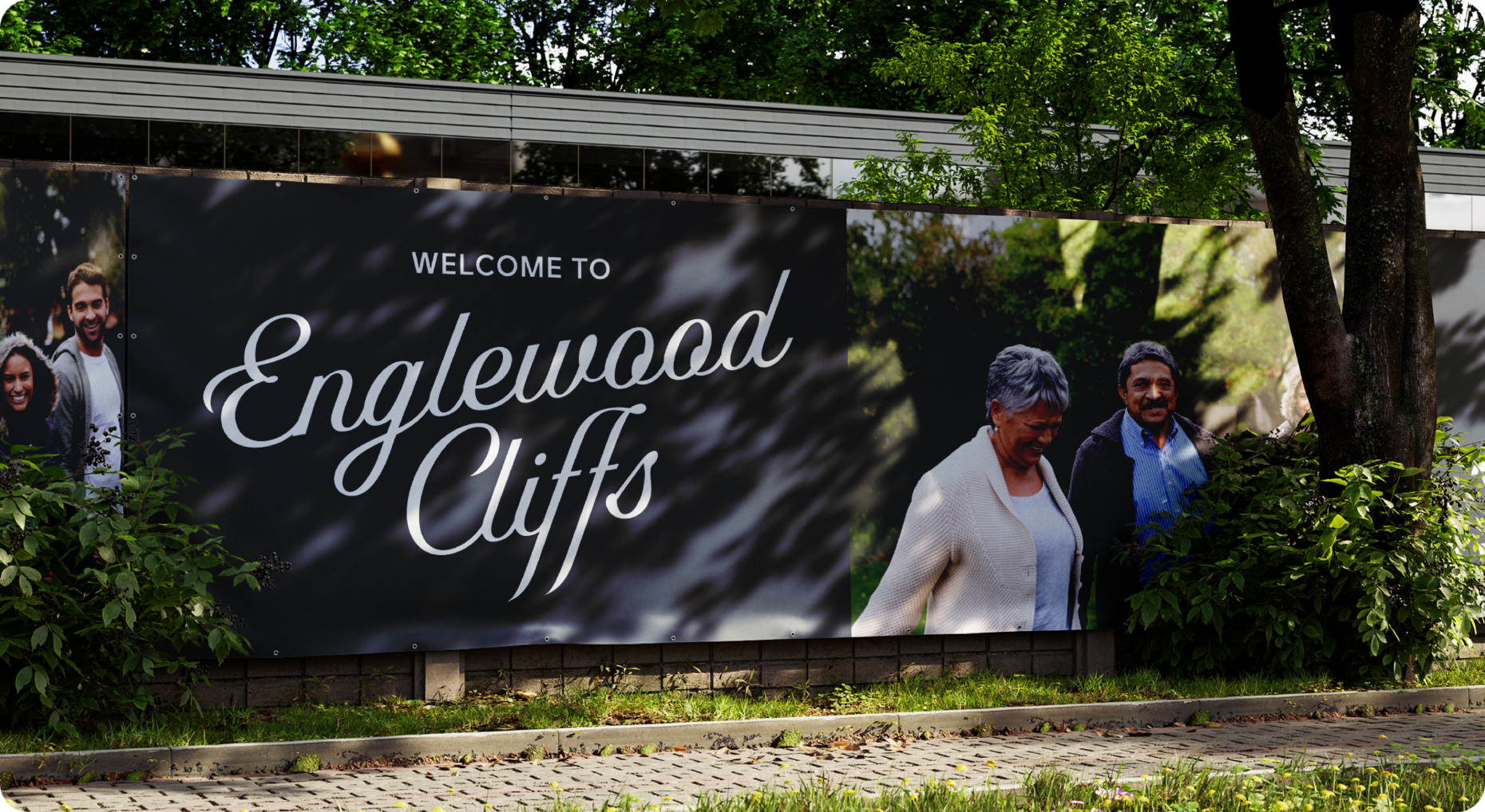
Englewood Cliffs has been around since 1895. That's over a century of history, community, and identity, none of which was reflected in how the borough was showing up digitally or visually. The borough's identity felt dated, the website was hard to navigate, and residents were left hunting for basic information. For a town this proud of where it came from, that gap mattered. The ask was straightforward: build a civic identity worthy of the community it represents.
Borough Of Englewood Cliffs


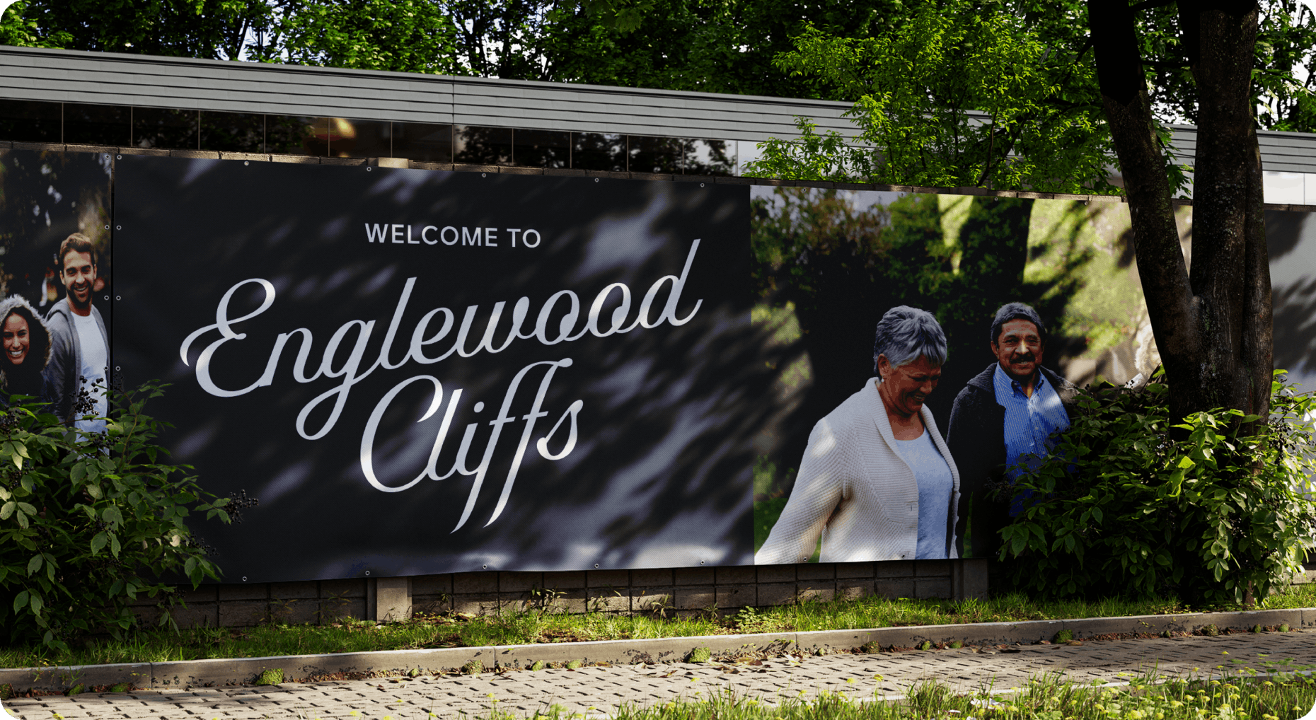
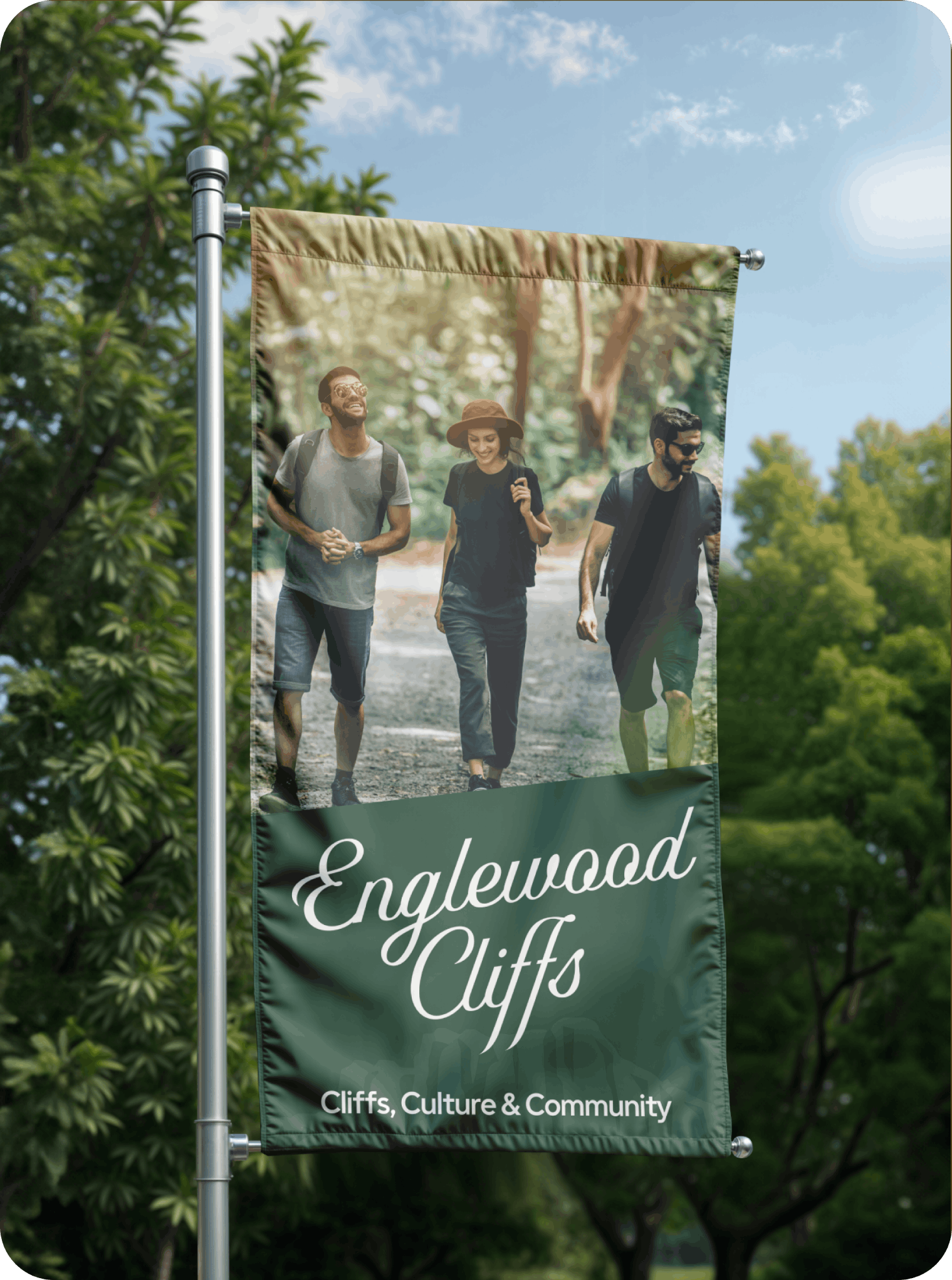
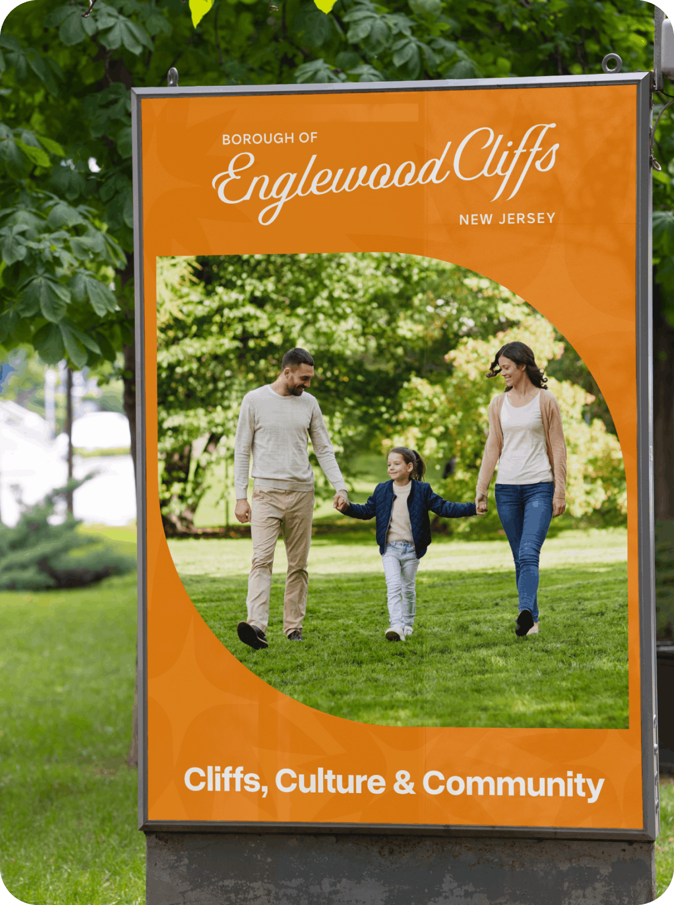
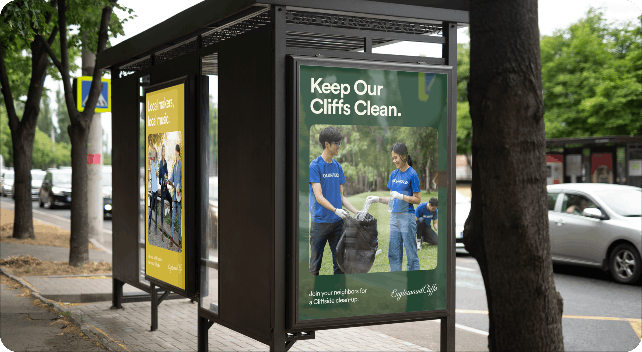
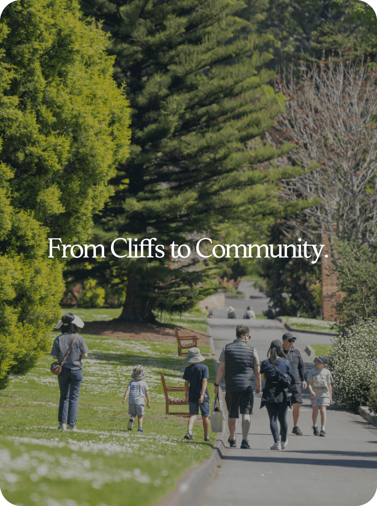
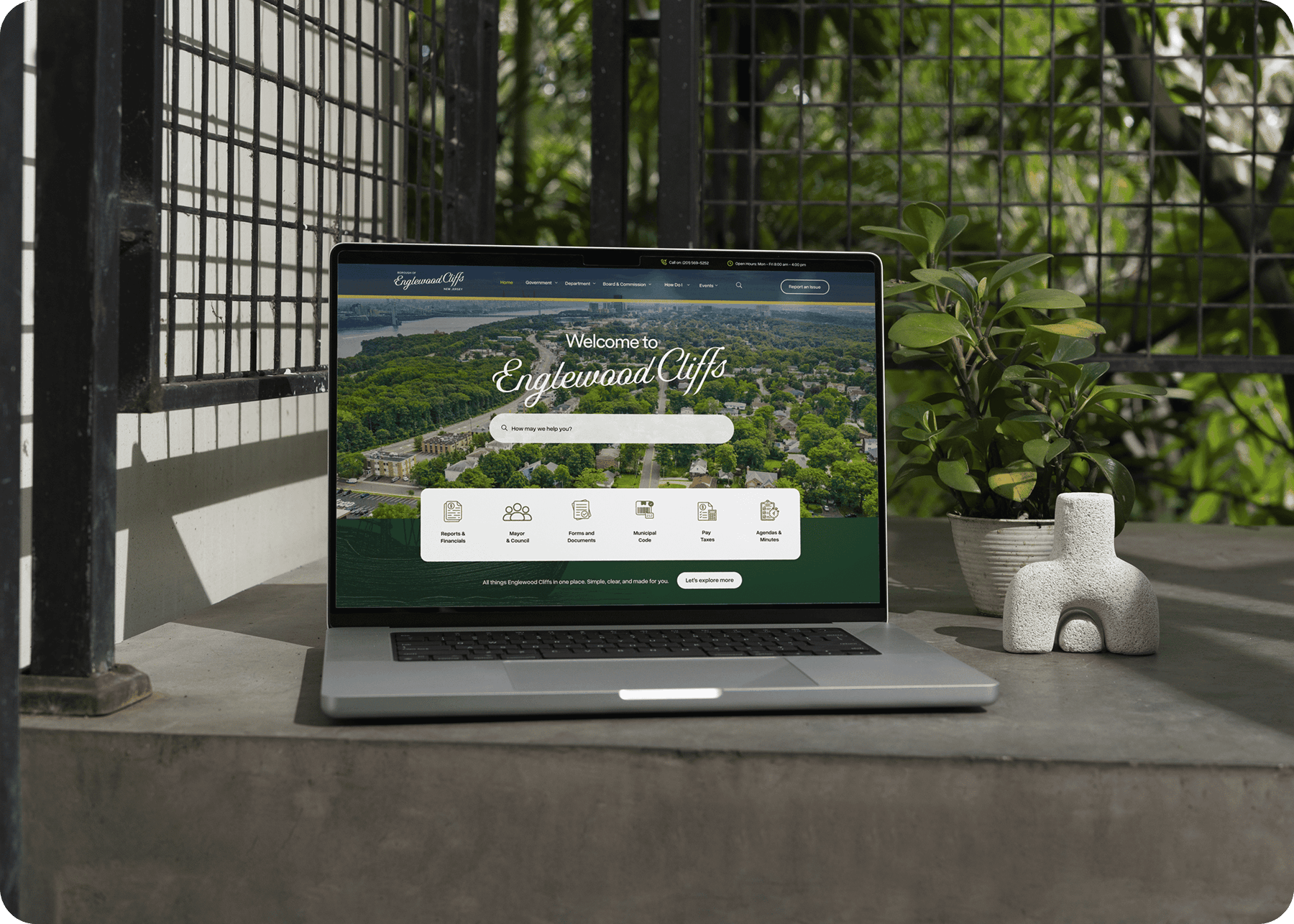
A civic identity has to do something most brands don't. It has to serve everyone. Seniors, young families, longtime residents, new ones. That means clarity isn't just a design preference, it's a civic responsibility. The north star was simple: two clicks to anything. If a resident lands on the site and can't find what they need in two clicks, I failed. Everything from the navigation to the visual language to the copy was built around that principle. From there, the design pulled from what makes Englewood Cliffs itself: the landscape, the cliffs, the quiet confidence of a small borough with a big sense of place. The goal wasn't to make it look like a startup. It was to make it feel like home, just one that finally knew how to present itself.
No items found.
No items found.
